

One of the most important components in Angular Material is the input component. Angular Material supports different types of input elements like color, date, email, month, number, password, etc. In this article, we are going to use the input components to create a Create-Owner component and use it to create a new Owner object in our database.
Of course, we will show how easy it is to apply Angular Material Form Validation with the material input components and also how to create dialogs to show the error or success messages. We won’t dive deeply into the validation logic because we already have a great article that covers that topic Angular Form Validation.

For the complete navigation and all the basic instructions of the Angular Material series, check out: Introduction of the Angular Material series.
The source code is available at GitHub Angular Material Form Validation – Source Code
We strongly recommend reading our Angular Series prior to reading this article, if you want to restore your knowledge about that topic or to learn Angular development overall.
Let’s start step by step.
We are going to divide this article into the following sections:
- Owner Component and the Routing Configuration
- Adding Angular Material Form Validation and Input Elements
- Adding Dialogs and Shared Module
Owner Component and the Routing Configuration
To create our new component, we have to type a familiar command:
ng g component owner/owner-create --skipTests
Once we have our component created, let’s configure the routing part in the owner-routing.module.ts file:
import { OwnerCreateComponent } from '../owner-create/owner-create.component';const routes: Routes = [
{ path: 'owners', component: OwnerListComponent },
{ path: 'details/:id', component: OwnerDetailsComponent},
{ path: 'create', component: OwnerCreateComponent }
];
Finally, let’s modify the owner-list.component.html file, by adding a link that will point to the owner-create component:
<div fxLayout fxLayout.lt-md="column wrap" fxLayoutAlign="center center" fxLayoutGap.gt-sm="250px" fxLayoutGap.lt.md="20px">
  <mat-form-field>
    <input matInput type="text" (keyup)="doFilter($event.target.value)" placeholder="Filter">
  </mat-form-field>
  <div>
    <a [routerLink]="['/owner/create']" mat-button color="primary">Create Owner</a>
  </div>
</div>
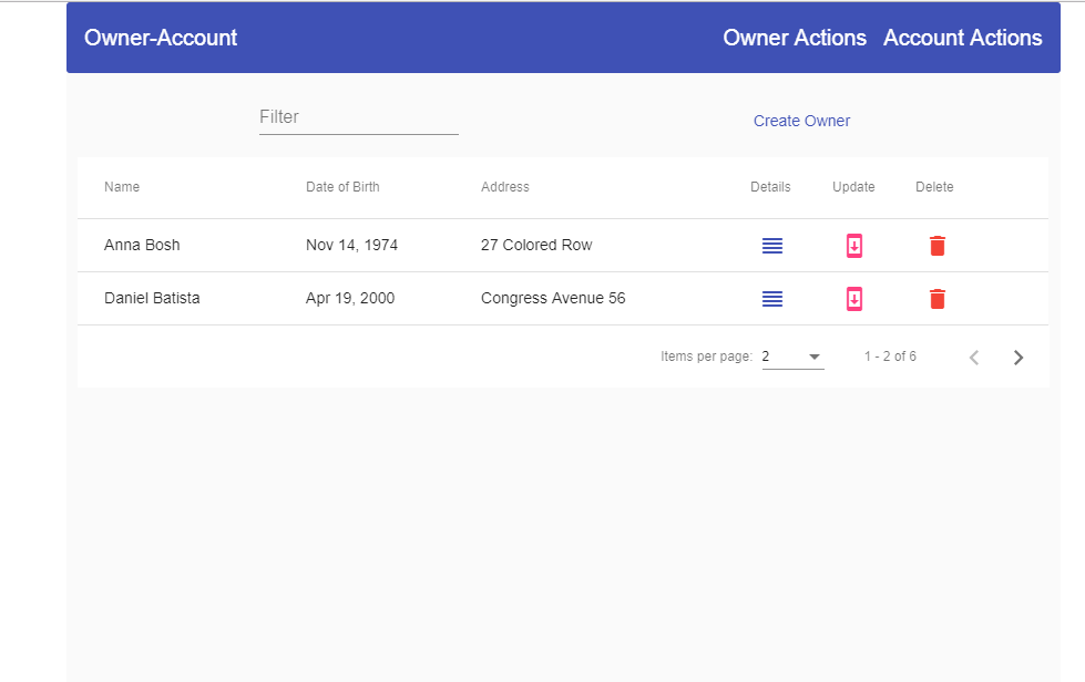
Now we can inspect our result:
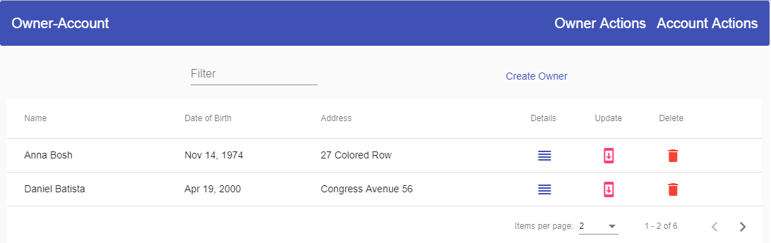
And if we click on the Create Owner button, we are going to be directed to the owner-create component for sure.
Adding Angular Material Form Validation and Input Elements
Before we start adding input fields, we need to import one more module into the owner.module.ts file:
import { ReactiveFormsModule } from '@angular/forms';imports: [ …, ReactiveFormsModule ],
We need this module for the reactive form validation.
In addition to input components, we are going to use the datepicker material component and for that, we need the MatDatepickerModule and MatNativeDateModule inside the material.module.ts file:
Import{ MatDatepickerModule } from '@angular/material/datepicker';
import { MatNativeDateModule } from '@angular/material/core';
imports: [
MatDatepickerModule,
MatNativeDateModule
...
exports: [
MatDatepickerModule,
MatNativeDateModule
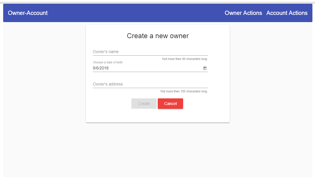
After all these imports and registrations, we can start with the owner-create.component.html file modification:
<section fxLayout="row wrap" fxLayoutAlign="center center">
  <mat-card fxFlex="500px" fxFlex.xs="100%">
      <mat-card-title>Create a new owner</mat-card-title>
      <mat-card-content>
      </mat-card-content>
      <mat-card-actions>

      </mat-card-actions>
    </mat-card>
</section>
The mat-card-content and mat-card-actions elements need to be wrapped with the form tag:
<form [formGroup]="ownerForm" autocomplete="off" novalidate (ngSubmit)="createOwner(ownerForm.value)" fxLayout="column wrap"
      fxLayoutAlign="center center" fxLayoutGap="10px">
  <mat-card-content>
  </mat-card-content>
  <mat-card-actions>
  </mat-card-actions>
</form>
Then inside the mat-card-content tag, we are going to add the following code:
<mat-form-field>
  <input matInput type="text" placeholder="Owner's name" formControlName="name" id="name">
  <mat-hint align="end">Not more then 60 characters long.</mat-hint>
  <mat-error *ngIf="hasError('name', 'required')">Name is required</mat-error>
  <mat-error *ngIf="hasError('name', 'maxlength')">You have more than 60 characters</mat-error>
</mat-form-field>

<mat-form-field>
  <input matInput [matDatepicker]="picker" placeholder="Choose a date of birth" formControlName="dateOfBirth" id="dateOfBirth"
      readonly (click)="picker.open()">
  <mat-datepicker-toggle matSuffix [for]="picker"></mat-datepicker-toggle>
  <mat-datepicker #picker></mat-datepicker>
</mat-form-field>

<mat-form-field>
  <input matInput type="text" placeholder="Owner's address" formControlName="address">
  <mat-hint align="end">Not more then 100 characters long.</mat-hint>
  <mat-error *ngIf="hasError('address', 'required')">Address is required</mat-error>
  <mat-error *ngIf="hasError('address', 'maxlength')">You have more than 100 characters</mat-error>
</mat-form-field>
Finally, let’s modify the mat-card-actions element:
<mat-card-actions align="center">
  <button mat-raised-button color="primary" [disabled]="!ownerForm.valid">Create</button>
  <button type="button" mat-raised-button color="warn" (click)="onCancel()">Cancel</button>
</mat-card-actions>
We have completed the HTML part, and we are ready to modify the owner-create.component.ts file. But before we do that, we are going to create a new interface OwnerForCreation:
export interface OwnerForCreation {
    name: string;
    dateOfBirth: Date;
    address: string;
}
Right after that, we are going to modify our .ts file:
import { RepositoryService } from './../../shared/repository.service';
import { Component, OnInit } from '@angular/core';
import { FormControl, FormGroup, Validators } from '@angular/forms';
import { Location } from '@angular/common';
import { OwnerForCreation } from '../../_interface/ownerForCreation.model';

@Component({
  selector: 'app-owner-create',
  templateUrl: './owner-create.component.html',
  styleUrls: ['./owner-create.component.css']
})
export class OwnerCreateComponent implements OnInit {
  public ownerForm: FormGroup;

  constructor(private location: Location, private repository: RepositoryService) { }

  ngOnInit() {
    this.ownerForm = new FormGroup({
      name: new FormControl('', [Validators.required, Validators.maxLength(60)]),
      dateOfBirth: new FormControl(new Date()),
      address: new FormControl('', [Validators.required, Validators.maxLength(100)])
    });
  }

  public hasError = (controlName: string, errorName: string) =>{
    return this.ownerForm.controls[controlName].hasError(errorName);
  }

  public onCancel = () => {
    this.location.back();
  }

  public createOwner = (ownerFormValue) => {
    if (this.ownerForm.valid) {
      this.executeOwnerCreation(ownerFormValue);
    }
  }

  private executeOwnerCreation = (ownerFormValue) => {
    let owner: OwnerForCreation = {
      name: ownerFormValue.name,
      dateOfBirth: ownerFormValue.dateOfBirth,
      address: ownerFormValue.address
    }

    let apiUrl = 'api/owner';
    this.repository.create(apiUrl, owner)
      .subscribe(res => {
        //this is temporary, until we create our dialogs
        this.location.back();
      },
      (error => {
        //temporary as well
        this.location.back();
      })
    )
  }

}
The last thing we need to do is to modify the .css file:
mat-form-field{
    width: 400px;
}
mat-card-title{
    text-align: center;
}
Excellent. We have implemented Angular Material Form Validation in couple of steps and now we can check the result:
Adding Dialogs and Shared Module
We have finished the owner component creation but we need to inform a user about the creation result, whether it was successful or not. For that purpose, we are going to create two dialog components. One for the success message and another one for the error message.
Shared Module
Before we do that, we are going to create a shared module to register our dialog components and to register modules that are already registered inside the app module and owner module as well.
So, let’s create a shared module first:
ng g module shared
Now, let’s modify the shared.module.ts file:
import { NgModule } from '@angular/core';
import { CommonModule } from '@angular/common';
import { MaterialModule } from '../material/material.module';
import { FlexLayoutModule } from '@angular/flex-layout';

@NgModule({
  imports: [
    CommonModule,
    MaterialModule,
    FlexLayoutModule,
  ],
  exports: [
    MaterialModule,
    FlexLayoutModule
  ],
  declarations: []
})
export class SharedModule { }
Important: Because we now have the FlexLayoutModule and MaterialModule inside of the shared module file, we don’t need them anymore in the app and owner module files. Therefore, we can remove the FlexLayoutModule and MaterialModule imports from the app and owner module files and just import the SharedModule in both mentioned module files (app and owner).
Dialogs Creation
To continue, we are going to create our dialog components:
ng g component shared/dialogs/success-dialog --skipTests
ng g component shared/dialogs/error-dialog --skipTests
These modules are imported automatically in the shared.module.ts file, but we need to export them as well. Moreover, we need to place the dialog components inside the entryComponents array because we are not going to use routing nor app selector to call these components. We are going to use them as a template reference for the dialog’s open() function and thus the need for the entryComponents array:
exports: [
    MaterialModule,
    FlexLayoutModule,
    SuccessDialogComponent,
    ErrorDialogComponent
  ],
  entryComponents: [
    SuccessDialogComponent,
    ErrorDialogComponent
  ]
Success Dialog Modification
Let’s open the success-dialog.component.html file and modify it:
<section fxLayout="column" fxLayoutAlign="center center">
  <h1 mat-dialog-title>Success message</h1>
  <mat-dialog-content>
    <p>Action completed successfully</p>
  </mat-dialog-content>
  <mat-dialog-actions>
    <button mat-raised-button color="primary" [mat-dialog-close]="true">OK</button>
  </mat-dialog-actions>
</section>
One important thing to notice here is a usage of the mat-dialog-close attribute which instructs this button to close the dialog and submits a result (true in this case). To fetch this result, we need to subscribe to the afterClosed() function. We are going to do that a bit later.
We haven’t used the mat-dialog elements in our project, therefore we need to register it in the material module:
import { MatDialogModule} from '@angular/material/dialog';imports: [
MatDialogModule,
exports: [
    MatDialogModule,
Now, to use this success dialog, we are going to modify the owner-create.component.ts file. Our dialog needs to have a configuration, and we are going to provide that:
import { MatDialog } from '@angular/material/dialog';
...

private dialogConfig;

  constructor(private location: Location, private repository: RepositoryService, private dialog: MatDialog) { }

  ngOnInit() {
    this.ownerForm = new FormGroup({
      name: new FormControl('', [Validators.required, Validators.maxLength(60)]),
      dateOfBirth: new FormControl(new Date()),
      address: new FormControl('', [Validators.required, Validators.maxLength(100)])
    });

    this.dialogConfig = {
      height: '200px',
      width: '400px',
      disableClose: true,
      data: { }
    }
  }
To start our success dialog, we need to import MatDialog and to create a private variable in a constructor of the same type.
The dialogConfig object consists of several properties that describe the height, width, disable close dialog when clicking outside of the dialog, and passing data to the dialog. Because we don’t want to pass anything to the success dialog, we have left an empty data object.
Now, let’s modify the subscribe part of the component, to call this dialog:
let apiUrl = 'api/owner';
this.repository.create(apiUrl, owner)
  .subscribe(res => {
    let dialogRef = this.dialog.open(SuccessDialogComponent, this.dialogConfig);

    //we are subscribing on the [mat-dialog-close] attribute as soon as we click on the dialog button
    dialogRef.afterClosed()
      .subscribe(result => {
        this.location.back();
      });
  },
    (error => {
      //temporary as well
      this.location.back();
    })
  )
This is the result:
Error Dialog Modifications
We are going to send an error message to the error dialog and we don’t want to emit any event when we click the dialog button, therefore the Error dialog implementation will be a little different.
Let’s start by modifying the error-dialog.component.ts file:
import { Component, OnInit, Inject } from '@angular/core';
import { MAT_DIALOG_DATA, MatDialogRef } from '@angular/material/dialog';

@Component({
  selector: 'app-error-dialog',
  templateUrl: './error-dialog.component.html',
  styleUrls: ['./error-dialog.component.css']
})
export class ErrorDialogComponent implements OnInit {

  constructor(public dialogRef: MatDialogRef<ErrorDialogComponent>, @Inject(MAT_DIALOG_DATA) public data: any) { }

  ngOnInit() {
  }

  public closeDialog = () => {
    this.dialogRef.close();
  }
}
The dialogRef variable is here to help us manipulate our opened dialog and the data variable is here to accept any information passed to this component. Of course, we must use the MAT_DIALOG_DATA injection token to enable data acceptance from other components.
Now, we have to modify the error-dialog.component.html file:
<section fxLayout="column" fxLayoutAlign="center center">
  <h1 mat-dialog-title>Error message</h1>
  <mat-dialog-content>
    <p>{{data.errorMessage}}</p>
  </mat-dialog-content>
  <mat-dialog-actions>
    <button mat-raised-button color="warn" (click)="closeDialog()">OK</button>
  </mat-dialog-actions>
</section>
Having that done, let’s modify the error-handler.service file:
... Other imports
import { ErrorDialogComponent } from './dialogs/error-dialog/error-dialog.component';
import { MatDialog } from '@angular/material/dialog';

@Injectable({
  providedIn: 'root'
})
export class ErrorHandlerService {
  public errorMessage: string = '';
  public dialogConfig;

  constructor(private router: Router, private dialog: MatDialog) { }

... Other code

private handleOtherError(error: HttpErrorResponse){
    this.createErrorMessage(error);
    this.dialogConfig.data = { 'errorMessage': this.errorMessage };
    this.dialog.open(ErrorDialogComponent, this.dialogConfig);
  }
And finally, let’s modify the owner-create.component.ts file:
import { ErrorHandlerService } from '../../shared/error-handler.service';constructor(private location: Location, private repository: RepositoryService, private dialog: MatDialog, private errorService: ErrorHandlerService) { }
this.repository.create(apiUrl, owner)
      .subscribe(res => {
        let dialogRef = this.dialog.open(SuccessDialogComponent, this.dialogConfig);

        //we are subscribing on the [mat-dialog-close] attribute as soon as we click on the dialog button
        dialogRef.afterClosed()
          .subscribe(result => {
            this.location.back();
          });
      },
        (error => {
          this.errorService.dialogConfig = { ...this.dialogConfig };
          this.errorService.handleError(error);
        })
      )
And that is all. Now, we can check the result:
Conclusion
Excellent.
We have created a lot of features and covered a lot of material components. We have left out the update and delete functionalities, but this is something that you could do on your own now as an exercise.
In all the previous articles, we have covered all the material related logic we need for the Update and Delete actions (Forms, Validations, Input Fields, Dialogs, etc) and in Angular PUT Actions and Angular Delete Actions, we implemented all the required Angular related logic.
Of course, if you have any problem creating new functionalities, we have provided the source code for that as well.
So, feel free to read them, if you haven’t already, and make your own Update and Delete parts of this project.
Hi,
How can I horizontally align center the new owner create form?
Thank you very much for the information you have provided. It helped me a lot to build my Angular material form. I could not find so much detail anywhere else.
Thank you for reading the article and for your comment. I am glad it helped you.
Hi Marinko,
I found a couple issues with this tutorial – probably because of using a later version of Angular. 1) not a big problem, but the angular/cli prefers –skip-tests to –skipTests. 2) I found the
align="center"attribute for thetype="button"– or maybe that’s a test for people who copy/paste the tutorial ;-).As always, thanks for your excellent work.
Hello mc alex. Thanks for these suggestions. Well, with every new Angular version they add or remove something. Regarding skipping test files, first it was –spec=false, then, with later versions, Angular complainted and asked for –skipTests. Now, this is wrong as well, do you get my point 🙂 🙂
Regarding that align=”center” as you can see it really works in my project, so it must be something new as well with a newer Angular version.
Finally, i fixed that extra “>” sign. Yeah, I am testing how many people are coping our code and never come back to our site because the code doesn’t work 😀 😀
Create the owner-create component , add to routing to owner-routing.module.ts, add html then : localhost:5000/api…/create is return 400 after all. Any idea?
I use postman to check the url. Can you show me back-end code for this series, please?
The backend code is our ASP.NET Core project. You can just download it from our repo https://github.com/CodeMazeBlog/.NET-Core-Series. Use the part6 because this is the last part from .NET Core, other ones are for Angular.
Very helpful, thank you. I noticed a couple small things. The text says “The mat-cart-content and mat-cart-actions ..” but “cart” probably should be “card”. And “owner-create.compnent.html” is missing an “o”. Finally a question, the address form field has no “id” attribute, is that required?
Thanks for listening.
Hello Chris. Thank you very much for reading this article and making those suggestions. I fixed both typos. About the Id, it is not required, but if you use the id attribute in one of controls you should be using it in all of them, just for consistency sake, I just forgot to add it. Thank you one more time. Best Regards.