

In this article, we are going to show you how to prepare our Angular project and how to install Angular Material in a few simple steps. But first things first. Before we start with the Angular Material features, we need to create the project first.
So let’s dive right into it.

For the complete navigation and all the basic instructions of the Angular Material series, check out: Introduction of the Angular Material series.
The source code is available at GitHub Getting Started With Angular Material – Source Code
We are going to divide this post into several sections:
- Project Creation
- Angular Material Installation
- Creating Material Module
- Creating the Layout Component
- Creating Home Component and Using Material Tabs
- Additional Mat-Tab Features
- Conclusion
Project Creation
We are going to use Angular CLI through the entire project (and we strongly advise you to do the same), thus creating our project is no exception to that. So, let’s open a command prompt window and create our Angular project:
ng new ang-material-owneraccount
We don’t want Angular to create the routing and we are going to select the CSS for the stylesheet format.
Once the creation is done, we are going to start the Visual Studio Code editor and open our project.
Angular Material Installation
We are going to use the ng add command to install the required packages. Besides installing Angular Material, we need to have CDK and Animations as well.
So, let’s open the Terminal window in VS Code and execute the command:
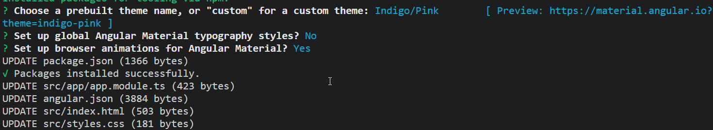
ng add @angular/materialTo continue, let’s include the prebuild theme for Angular Material. The theme is required and we can choose one of the available pre-built themes:
- deeppurple-amber.css
- indigo-pink.css
- pink-blugrey.css
- purple-green.css
We are going to select the Indigo/Pink. Additionally, we are not going to use global AngularMaterial typography styles and we are going to use the Angular Material Animations.
After the installation finishes, we should see this result:
Now, we can inspect the app.module.ts file and verify that the BrowserAnimationsModule is imported there:
import { BrowserModule } from '@angular/platform-browser';
import { NgModule } from '@angular/core';
import {BrowserAnimationsModule} from '@angular/platform-browser/animations';

import { AppComponent } from './app.component';

@NgModule({
  declarations: [
    AppComponent
  ],
  imports: [
    BrowserModule,
    BrowserAnimationsModule
  ],
  providers: [],
  bootstrap: [AppComponent]
})
export class AppModule { }
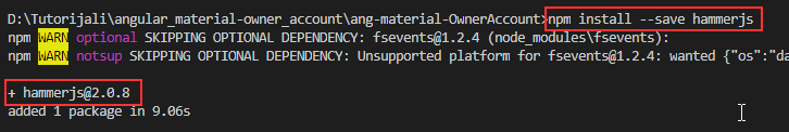
The next step is to install the
hammerjs library for gesture support. In order to have a full feature of some components, we need to install it:npm install --save hammerjs
After the installation, we are going to import it as a first-line in the maint.ts file:
import 'hammerjs';
We are going to use Material Icons in our project and we can check the index.html file, to verify it is imported during the installation:
<!doctype html>
<html lang="en">
<head>
  <meta charset="utf-8">
  <title>AngMaterialOwnerAccount</title>
  <base href="/">

  <meta name="viewport" content="width=device-width, initial-scale=1">
  <link rel="icon" type="image/x-icon" href="favicon.ico">
  <link href="https://fonts.googleapis.com/icon?family=Material+Icons" rel="stylesheet">
</head>
<body>
  <app-root></app-root>
</body>
</html>
Creating Material Module
Even though we can import all the required components into the app.module.ts file, this is not recommended. A better solution is to create a separate module with all the required material imports and then import that module into the app.module.ts file. That being said, let’s do it:
ng g module material --module app
This command will create a new folder material with the
material.module.ts file inside. But this file is missing one thing and that’s the exports array. So, let’s add it:import { NgModule } from '@angular/core';
import { CommonModule } from '@angular/common';
@NgModule({
imports: [
CommonModule
],
exports: [
],
declarations: []
})
export class MaterialModule { }
Finally, we can check that this module is imported in the
app.module.ts file:import { MaterialModule } from './material/material.module';imports: [
BrowserModule,
BrowserAnimationsModule,
MaterialModule
],
That is it. We have prepared everything we need to use the Material components. Without further ado, we are going to start using them.
Creating the Layout Component
This component is going to be an entry point for our entire application, so let’s create it and import its selector inside the app.component.ts file:
ng g component layout --skipTests
This command will create our component files and import them into the app.module.ts file.
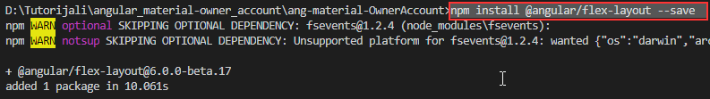
Angular Flex Layout
Before we modify the HTML component file, we need to install one more library: @angular/flex-layout. This library will help us create a responsive application. So, let’s install it:
npm install @angular/flex-layout --save
And we need to register it inside the app.module.ts file:
import {FlexLayoutModule} from '@angular/flex-layout';

imports: [
    BrowserModule,
    BrowserAnimationsModule,
    MaterialModule,
    FlexLayoutModule
  ],
Now, we can modify our
layout.component.html file:<div fxLayout="row wrap" fxLayoutAlign="center center" class="layout-wrapper">
<div fxFlex="80%" fxFlex.lt-md="100%" class="flex-wrapper">
<ng-content></ng-content>
</div>
</div>
As you can see, we use some angular/flex directives to create a responsive wrapper around our content. With the
fxLayout element, we define the flow order of the child elements inside the container. The fxLayoutAlign will position children according to both the main-axis and the cross-axis.The fxFlex element resizes the child element to 80% of its parent, and if the screen goes below the medium than the child will take 100% of its parent. If you want to read more about flex-layout, you can find plenty of material here: Flex-Layout-Documentation.
With the <ng-content> element, we are using angular content projection.
We have two more classes: layout-wrapper and flex-wrapper, so let’s implement them inside the layout.component.css file:
.layout-wrapper{
    height: 100%;
}

.flex-wrapper{
    height: 100%;
}
Excellent.
All we have to do is to remove all the content from the app.component.html file and introduce this component by using its selector:
<app-layout>
  Application works.
</app-layout>
We can start our application by typing
ng serve and see that the application actually works.
Creating Home Component and Using Material Tabs
Let’s create the Home component file structure first:
ng g component home --skipTests
Now, let’s modify the home.component.html file:
<section fxLayout="column" fxFlexAlign="stretch">
  <div fxFlexAlign="center">
    <p>Welcome to the Material Angular OwnerAccount Application</p>
  </div>

  <p>In this application we are going to work with:</p>
</section>
We need to modify the
app.component.html file:<app-layout> <app-home></app-home> </app-layout>
And we need to modify the
home.component.css file as well:section div p{
color: #3f51b5;
font-size: 30px;
text-shadow: 2px 3px 5px grey;
margin: 30px 0;
}
section div + p{
color: #3f51b5;
font-weight: bold;
font-size: 20px;
padding-bottom: 20px;
}
To use our first material component, the
mat-tab component, we need to register it inside the material.module.ts file:import { NgModule } from '@angular/core';
import { CommonModule } from '@angular/common';
import { MatTabsModule } from '@angular/material/tabs';
@NgModule({
imports: [
CommonModule,
MatTabsModule
],
exports: [
MatTabsModule
],
declarations: []
})
export class MaterialModule { }
And then to modify the
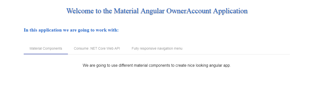
home.component.html file:<section fxLayout="column" fxFlexAlign="stretch">
<div fxFlexAlign="center">
<p>Welcome to the Material Angular OwnerAccount Application</p>
</div>
<p>In this application we are going to work with:</p>
<mat-tab-group>
<mat-tab label="Material Components">
<p>We are going to use different material components to create nice looking angular app.</p>
</mat-tab>
<mat-tab label="Consume .NET Core Web API">
<p>We will consume our .NET Core application. Basically, we will create complete CRUD client app.</p>
</mat-tab>
<mat-tab label="Fully responsive navigation menu">
<p>By using material components, we are going to create fully responsive navigation menu, with its side-bar as well.</p>
</mat-tab>
</mat-tab-group>
</section>
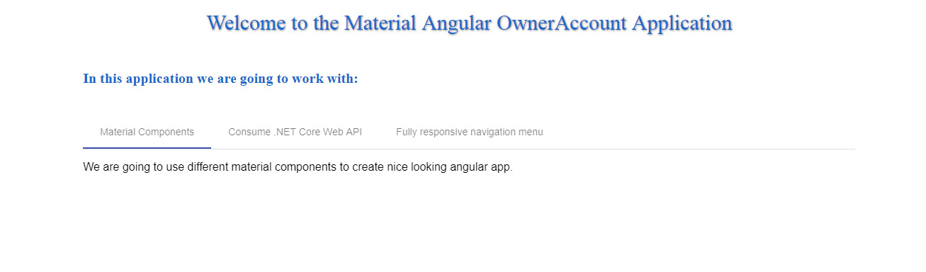
Now, we can inspect our result:
Additional Mat-Tab Features
First of all, let’s style our tab content a little bit more, to center our text inside every tab:
mat-tab-group {
    text-align: center;
}

mat-tab-group p {
    padding-top: 20px;
}
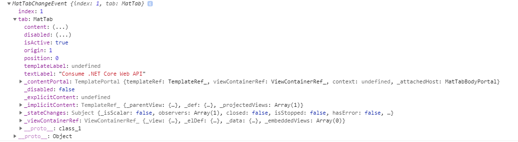
This control has its own events. The selectedTabChange event is emitted when the active tab changes. The focusChange event is emitted when the user navigates through tabs with keyboard navigation.
So, let’s use the selectedTabChange event:
<mat-tab-group (selectedTabChange)="executeSelectedChange($event)">
And we need to modify the
home.component.ts file:public executeSelectedChange = (event) => {
console.log(event);
}
Right now, as soon as we switch our tabs, we will see the event object logged into the console window:
Conclusion
Everything looks great. We have our first material component and in the following articles, we are going to work with other material components as well.
In this article we have learned:
- How to prepare the Angular project,
- How to install Angular Material, CDK, and Animations
- The way to install and use the @angular/flex-layout library
- How to work with the Tab Material component
In the next article, we are going to learn more about creating a navigation menu and menu side-bar with Angular routing.
Hey, greate article… do also have articles about clean architecture of an angular app or how to build an angular template with clean architecture structure?
Hello Mich. Thanks. No, we don’t have such an article. We have a lot of articles combining Angular and Web API but not about Angular clean architecture.
Instead of
ng g component layout --spec falseuseng g component layout --skip-testsOr just use
-Swhen creating the projectThanks David. I missed that during the series update. Will be fixed.
I’m getting the following error:
Error: Error on worker #4: Error: No typings declaration can be found for the referenced NgModule class in static withConfig(configOptions,
// tslint:disable-next-line:max-line-length
breakpoints = []) {
return {
ngModule: FlexLayoutModule,
providers: configOptions.serverLoaded ?
[
{ provide: LAYOUT_CONFIG, useValue: Object.assign(Object.assign({}, DEFAULT_CONFIG), configOptions) },
{ provide: BREAKPOINT, useValue: breakpoints, multi: true },
{ provide: SERVER_TOKEN, useValue: true },
] : [
{ provide: LAYOUT_CONFIG, useValue: Object.assign(Object.assign({}, DEFAULT_CONFIG), configOptions) },
{ provide: BREAKPOINT, useValue: breakpoints, multi: true },
]
};
}.
Command
>ng add @angular/material
simplifies installation. It installs all material components, browser animation module and icons. Installation process will ask you about hammer.js and preferred theme.
Yes you are right, but in the moment of creating this series, that command wasn’t that stable. Still, I believe that people should know the bigger picture, to see what they get out of the box. It is similar with angular regular projects, from the version 6 you can choose wether you want to create manualy routing module or CLI to create it for you. But if you know nothing about routing module, this auto system doesn’t help you. So, the same situation is here as well. But thank you for the comment, readers will see the shorter installation version now. Best regards.
Nice one for beginners
after installing the packages it appeared module errors that it couldn’t find current modules, finally i fixed it after trying about an hour….
Hello Zura. Thank you for reading this article but to be honest I can’t understand, what is your point. This tutorial is tested several times, even I tested it right now, after reading your comment, just to make sure that something didn’t change meanwhile and everything works like a charm. So we would appreciate more detailed explanation of your problem and of course, how did you fix it, because maybe someone else could have the same problem and they can read the solution in the comment section. All the best.
Nice work!
I know CSS is the default for Angular, and introducing SASS risks adding complexity, but developing any non-trivial app or site quickly shows up the problem of keeping many instances of a brand colour, border style, font, updated.This is exactly what SASS (and others) aim to fix.
I think use of SASS in these examples would hardly change the code at all, but would start novice developers out with the right tools in place. Modifying Material away from the obvious ‘standard’ themes is a nightmare without using a pre-processor like SASS.
Any chance future articles might demonstrate Angular + Material along with SASS for a more real-world developer experience?
Hello Brian. You have a point for all the parts of your comment. SASS for this project level would add additional complexity, still repeating CSS code is not a choice, we all want to do not repeat our selves while coding. And for this example SASS wouldn’t change a lot, if any at all. But what I believe is that for newly developers is mandatory to know CSS first and then to upgrade that knowledge with SASS (of course, we are not teaching here CSS, but that is just my opinion).
There is always possibility to use SASS in any of our other projects. We are mainly .NET, .NET Core blog site, but I like Angular a lot, thus the several articles on Angular series and now on Material as well.
Thank you very much for your suggestion and for reading this article. Looking forward to hear from you. All the best.